How to Create Modular Modals in Vue.js
Why do we need modular components and how to make them?
When we need to add common UI components (like modals or notification toasts), we often import packages from npm. The modular nature of this approach helps us with some important concepts: maintainability, scalability, and reusability.
The JavaScript ecosystem provides us with plenty of packages to choose from and we can easily plug them inside our project without any complex setup, and they are almost always good enough.
But what if provided module is a bit of an overhead for our case? On the other hand, what if we need to extend it dramatically or to have full control over it?
Good thing is that it’s simple enough to implement on your own. This article covers my own experience with building a modal component from scratch. The final result is available at Github Pages. You could also grab the source code in this Github repo, use this sandbox, or code along.
Bootstrapping Project
Let’s create a simple project with Vue CLI:
vue create my-projectSelect Default Vue 2 settings when being prompted.
After successful installation change to the project directory:
cd my-projectNow we could start working on our project structure. Let’s remove the default component and add new ones — the result should look like this:
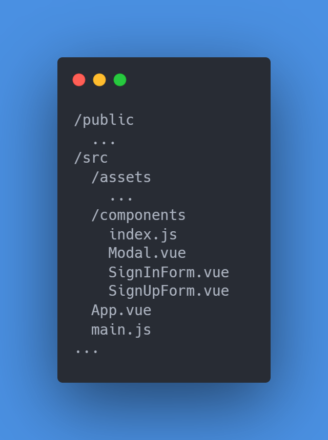
Let’s see what we have:
- App component is the root of our app;
- Modal component to create our modal;
- SignInForm and SignUpForm components to use inside the Modal component;
index.jsjust to have a nice one-line import of our components.
Here’s how the App component looks like in the very beginning:
Note that we have two modals for each of the forms. This is the approach I would use: one modal — one purpose. At the moment modals are always hidden. We will implement open/close logic later.
Now, let’s have a look at the Modal component:
There is not much to say about it right now so let’s proceed to Form components:
They are almost the same and not so interesting at the moment.
Finally, make sure your index.js looks like this:
Lastly, you could add some fancy font. To do so, simply put the <link /> tag with the desired font in the index.html file located in the /public directory and change the font-family property in the App component <style /> tag. I chose Open Sans for this project but you could use whatever you like.
Let’s check our app:
npm run serveIf you followed along, you should see something like this:
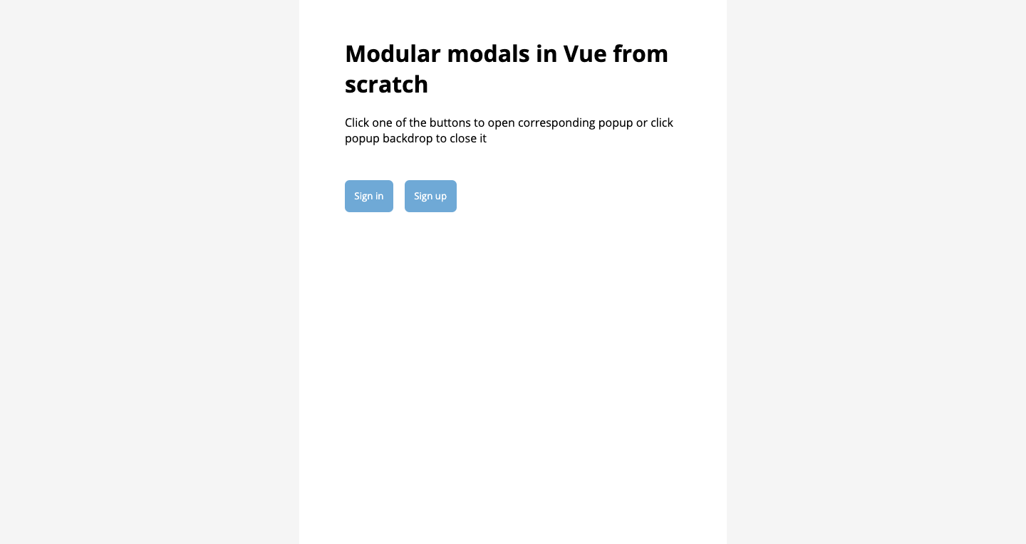
Now that we have a nice-looking app, we have to choose an approach to work with modals.
Custom Events Approach
The first approach is to add some data to the App component to store modals’ visibility state and controls to change it. Let’s do it:
We added isSignInModalOpen and isSignUpModalOpen flags that control the visibility of the corresponding modal. We can change them by clicking Sign in/Sign up buttons. Also, we added a listener to the custom event that the modal will emit to close itself.
One little addition to the Modal component for it to be able to close itself:
Note that we use self modifier on the click event listener to make sure we emit the close event only when we click on the backdrop.
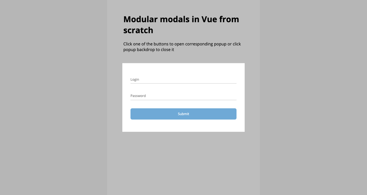
Now, if we click one of the buttons, we will see the corresponding modal show up!
It looks like a good approach: we added a very straightforward logic to control modals and we did it really fast. What could go wrong?
Consider this example:
What if we put buttons that control modals’ state inside another component? What if we want Form components to be able to close the modal in which they are in? We have to add custom events in both cases and generally in every situation when we want to change the modal state inside nested components.
While it looks relatively not so bad in the example above, it may be much worse when we have deeply nested components. There is a couple of approaches to handle this:
- Emit custom events from the deepest child that changes modal state to the App component itself;
- Use
$root.$emitin the child to emit the custom event and$root.$onin the App component to listen to it and to react to it; - Using
$root.$emitwith$root.$onmay be a good solution but there is a better approach that doesn’t require you to add any custom state management to control modals.
Plugin Approach
Just like the official documentation says:
Plugins are self-contained code that usually add app-level functionality to Vue
This is what we’re going to do: write a plugin and attach it to the Vue prototype so we could use it everywhere. Here’s how it’s going to work:
- Plugin exposes open/close methods;
- Modal component has its own state to decide whether to show itself or not;
- Modal component listens to plugin events to change their state.
This approach enforces a certain pattern for working with modals, and also ensures the complete independence of every modal in our app — we have lesser room to introduce bugs and we don’t need to manage modals’ state ourselves. It’s an easy-to-use, declarative, and truly modular solution that we could effortlessly re-use in another app. Let’s write some!
First, we need to add another directory for the plugin:
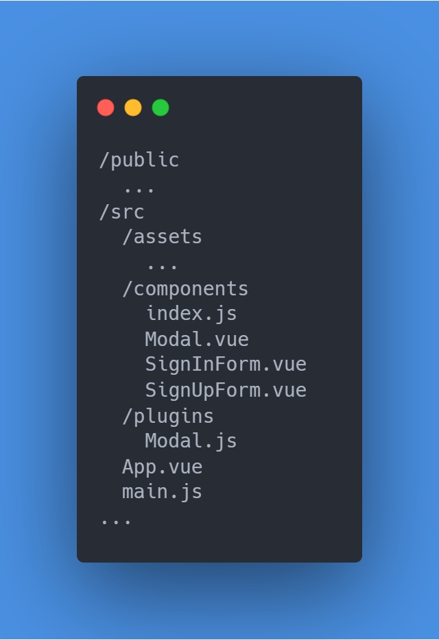
The plugin should look like this:
Let’s have a look at it: we implemented the Singleton pattern, created another Vue instance to use as an event bus, and globally registered the Modal component.
The next step is to register the plugin in the main.js file:
After that, refactor the Modal component:
Now, the component itself controls its own state with isOpen flag. Each component instance listens to the plugin events and decides their state based on them, which is why we have to provide the modal with a name prop.
Finally, let’s rewire the App component:
Now, all we have to store in the App component are modal names. Everything else is covered by the plugin itself. All we have to do to get it up and running is to use the plugin, put the Modal components in one place, give them names and then just use the plugin methods in any part of our app. You don’t have to make any additional steps to use this plugin anywhere else, the setup process will be the same.
In this article, we covered two approaches to write modular modal components in Vue.js. Modular components help us to write a cleaner, easier-to-maintain code that could be easily re-used. Thinking of code in a modular way may take some time to master but it will save you a ton of time in the long term, so I strongly recommend trying it.
Have a good day!